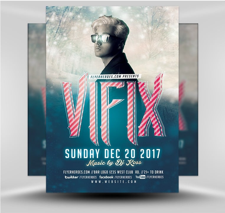
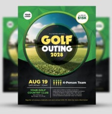
It’s time to start promoting your venue as the place to party this Christmas season. Don’t overlook the promotional power of flyers, especially one as edgy and engaging as this. Use this Christmas flyer alone, or in combination with other marketing methods, to avoid getting lost amidst the holiday event marketing noise! Our Christmas template makes it super easy to say what you want to say and use the images you want to use.
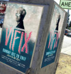
Print it out in different sizes to distribute in a variety of ways: by postal mail, face to face, at the entrances of stores, and more. You can distribute this flyer digitally by email or by mass mailing a promotional newsletter to all of your contacts. Post it on Facebook, your website, and other social media pages. If you really want to get creative you can hire a bad Santa and his naughty elves to distribute your promotional holiday party flyers in front of nightclubs and bars. Or, attach candy canes to the flyers and pass them out to moviegoers waiting in line at your local theater. To keep the promotion going 24/7, post the flyers in bars, on bulletin boards in community centers, and other high-traffic areas.
There’s no limit to the places you can market your Christmas party event.
What Fonts Do I Need?
- Christmas Bash Flyer Template 3
- Christmas Fair Template
- Christmas Flyer 2017 v1
- Christmas Costume Party Flyer Template
- View All
General Information:
This flyer template is a premium Photoshop PSD flyer/poster template designed by FlyerHeroes to be used with Photoshop CS4 and higher.
Once you have purchased this flyer template, you are free to make any customizations and modifications you’d like.
You are also granted an unlimited use and 100% royalty-free license, meaning you can use this product as many times as you wish. You are free to use this product in both personal and commercial work.
You can read more about our file licenses here and our file requirements here.
Please note, stock models/photographs of people are used for demonstration purposes only and are not included in the final download. We do however include a blank placeholder layer to make using your stock photos as easy as possible.
If you have any further questions, please feel free to direct your questions to FlyerHeroes Support.

